
Espaço ao Cubo / Association & mission identity / c. 2022–23
Space, in
three dimensions.
Espaço ao Cubo is a Portuguese youth association bringing students together around space technology and aerospace education, through practical projects, workshops and outreach.
I created the visual identity for the association and its TejoOne project.
Brand concept · Logo design · Visual system
Hubert Dungen


01 / THE CUBE
One form. Three faces.
The symbol reads as a cube and a name. Its faces give the identity depth while keeping a clear silhouette at smaller sizes.

02 / IN CONTEXT
Geometry beyond the logo.
The cube becomes a point of reference across the identity. Lines, planes and contrasting surfaces carry that structure into the surrounding layout.
SPACE, IN THREE DIMENSIONS.IDENTIDADE VISUALESPAÇO AO CUBO
03 / TEJOONE
A student mission. A shared identity.
TejoOne is the association’s student-developed 1U CubeSat: a technology demonstrator designed to explore optical detection of space debris and build practical space-engineering skills.
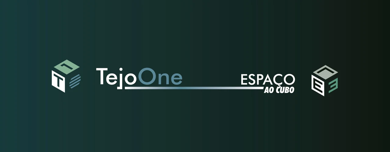
Discover the TejoOne mission ↗Its identity shares the cube-based geometry of Espaço ao Cubo, with a distinct wordmark and blue-green palette.


Visual identity and original artwork by Hubert Dungen. The presentation studies above show applications of that identity.