
Milling our imagination
Brand identity / Multimedia & audio / 2016
An identity for a Portuguese multimedia and audio company. One mark, carried from the studio to print and digital.
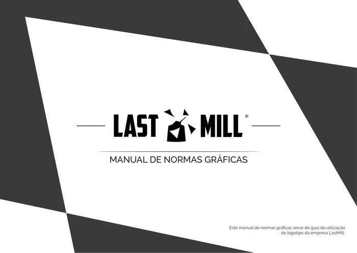
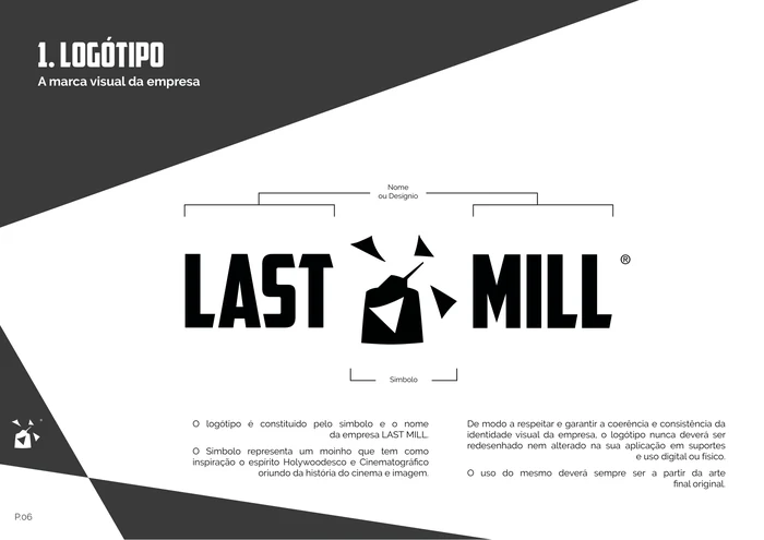
The symbol is a mill drawn with a cinematic, Hollywood spirit, its sails thrown out like shards of light. The name recalls the place where the company began, and the renewal it set out to bring to Portuguese audiovisual work.
01 / The mark
One mill,
four versions.
Horizontal and vertical, positive and negative. The alternatives never add a colour or a graphic element: only the negative inverts the original.
02 / The rules
Room to
breathe.
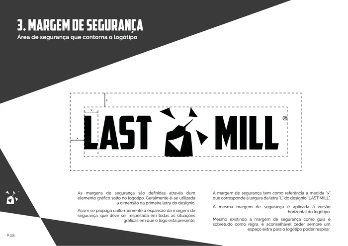
A graphic standards manual fixes the clear space, minimum size, colour and the misuses to avoid, so the mark arrives intact on every surface.
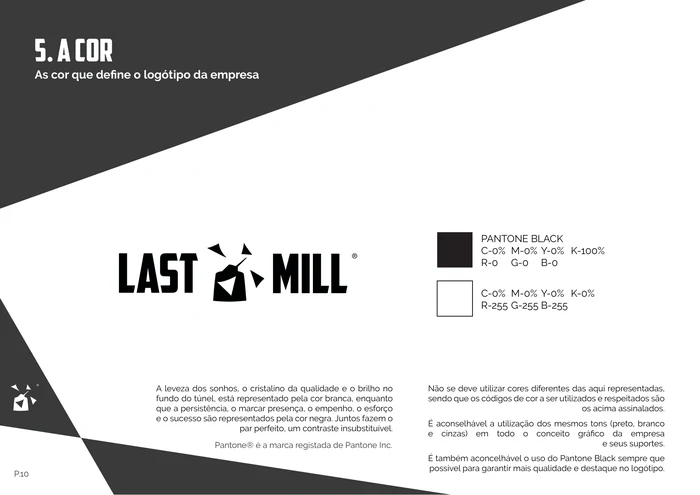
Persistence, presence, effort and success.
The lightness of dreams and the light at the end of the tunnel.
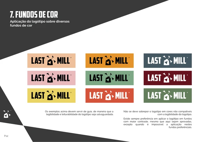
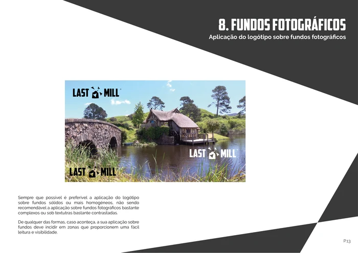
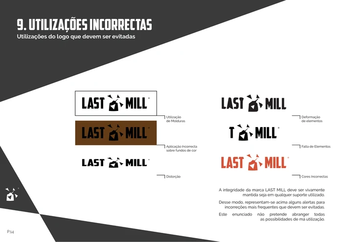
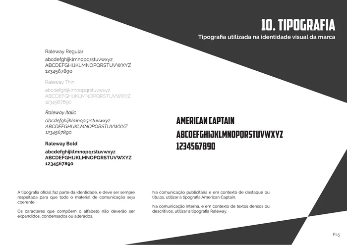
Graphic standards manual / 18 pages · scroll sideways
03 / Print
Made to
be held.
Regular and special business cards. The same monochrome language, adapted across fronts, backs and formats, with the line printed on the back: “Milling our imagination, to realize your last conception.”
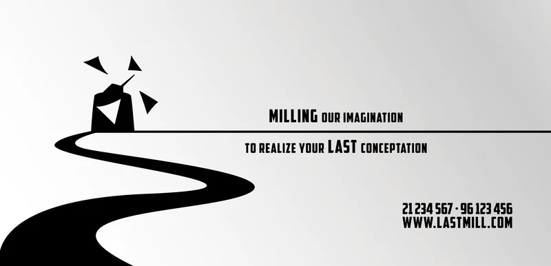
Front, band variation and reverse / print artwork
04 / VIP
A different
kind of access.
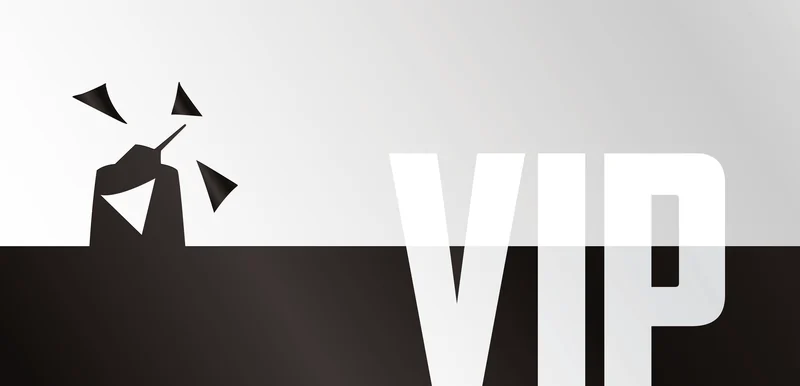
VIP cards bring metallic colour into the black-and-white system: gold, silver and bronze, each on the same dark field.

05 / Screen
From print
to screen.
The same calm horizon carried to the video channel: a wide banner and the symbol alone as the profile picture.
06 / Productions
One mill,
several voices.
Last Mill’s own productions each received a mark of their own, close enough to stay in the family.
BEcomingA channel for unknown talent · 2017 
DocumentariesDocumentary productions · 2018 
Last TalkLogo · 2019 
Poetic BloodlinesLogo · 2019