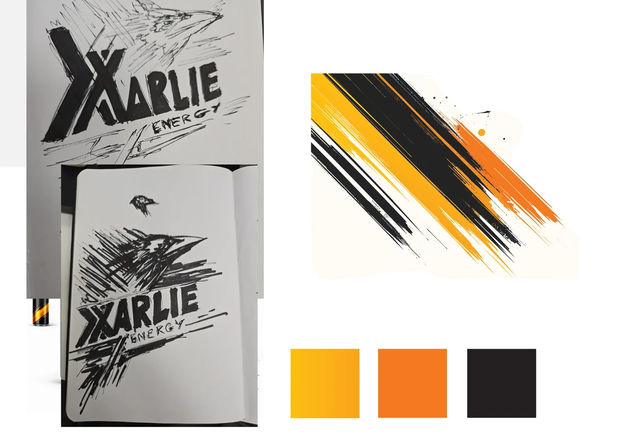
Design Visual / Partner brief: XARLIE CCL
2026 / Academic project
XARLIE ENERGÉTICO / Identity · Packaging · Campaign
Find your
own rhythm.
A visual identity for an energy drink, developed from a real partner brief by XARLIE Companhia de Cervejas de Leiria.
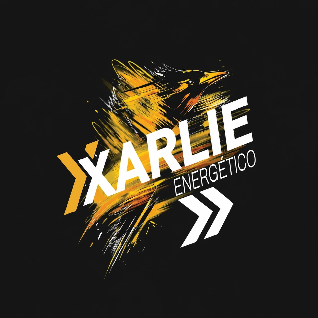
02 / A connected system
A mark.
A direction.
The wordmark, mascot and supporting symbol have different jobs, but share the same forward movement.
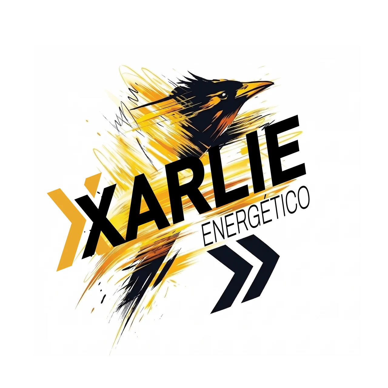
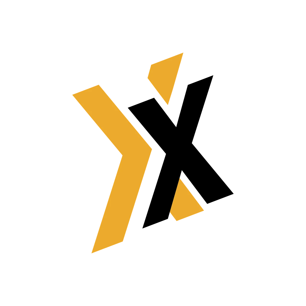
Signal yellow / energyOrange / momentumInk / contrast
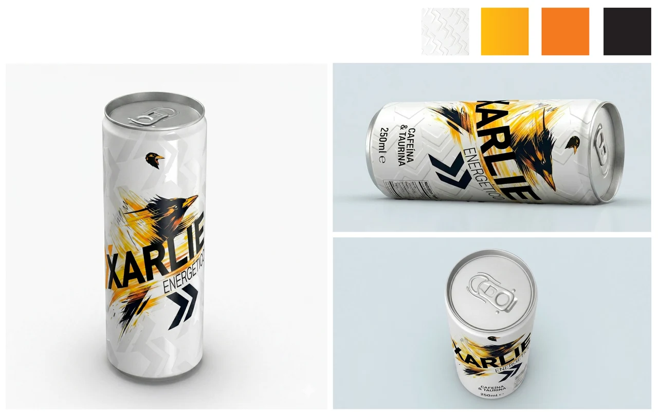
03 / On the can
Built to
be recognised.
The can carries the core visual language: a clear name, a strong focal point and enough white space for the product information.
04 / In context
From identity
to presence.
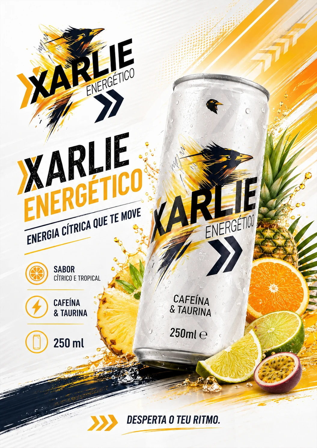
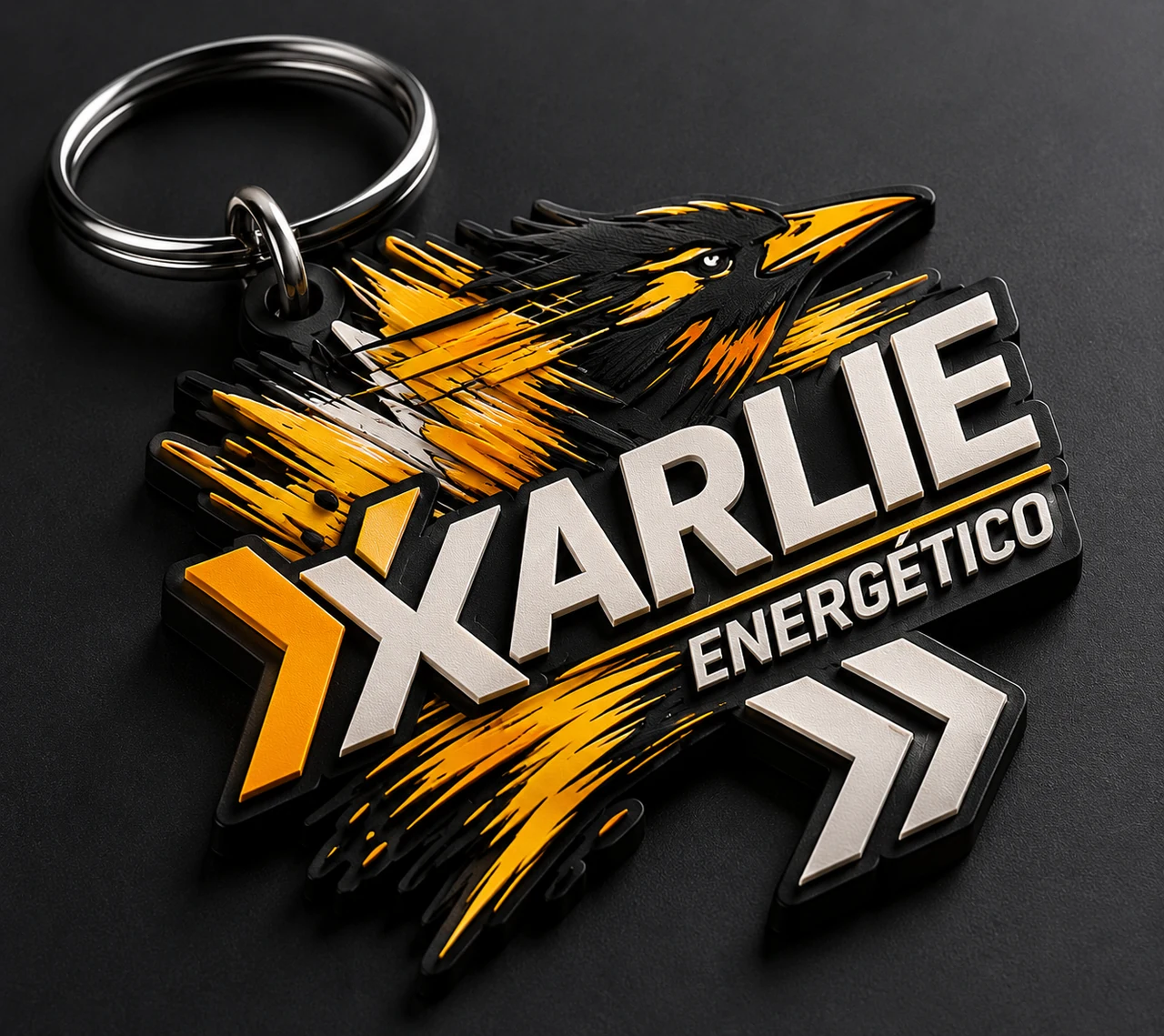
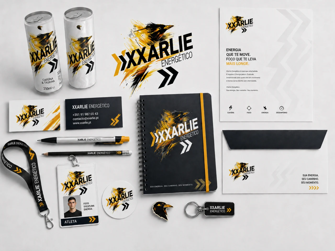
The campaign brings the original composition into a larger format. Supporting application studies explore how the identity could extend into objects and stationery.
See the development studies